portfolio
Rachel
Waterman
Writer | Editor | GrAPHIC Designer
I am a writer, editor, graphic designer, & photography enthusist

Welcome to my online portfolio!
I am a dedicated learner and collaborator who is passionate about words and visuals. I love the puzzle of clarifying meaning and impact through language and design. My hope is to do work that incorporates my skills and passions and gives me the opportunity to work with others to make the world a better place.
Background
Bethel University, 2018-2022
BA English Literature & Writing
Minor in Graphic Design
Values
- Connectedness
- Curiosity
- Creativity

Experience/Skills
- Writing Tutor
- Editor
- Nonfiction editor for undergraduate literary journal, the Coeval
- Developmental & line editor for fellow Bethel alum
- Writer
- Graphic Design
- Website development & design
- Project Management
- Communication
- Attention-to-detail
- Cooperation
Food
Truck
Mock
Rebrand
project
OVERVIEW
Rebrand the Herbivorous Butcher’s food truck and help the company clarify its vision. Develop a brand strategy for the food truck by creating logos, a fresh truck and menu design, and eye-catching merchandise.
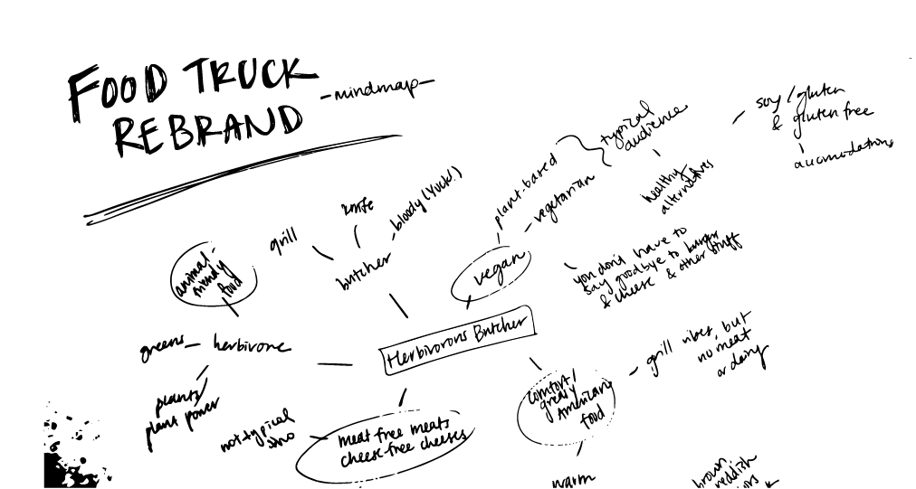
MINDMAP
RESEARCH & IDEATION
First, it was essential to identify what sets the Herbivorous Butcher apart from its competitors, its key audience, and the strengths and weaknesses of the current branding. I utilized a mind map to help brainstorm visuals. The designs should feel bold and inviting to vegans and non-vegans alike.
EXECUTION
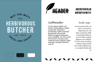
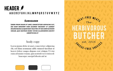
I achieved these goals by utilizing eye- catching pops of yellow throughout my designs. I chose to use yellow as a nod to
the company’s cheese-free cheeses. The contrast between yellow and black is bold yet simple, illustrating the qualities of vegan food, both in terms of place in the market as well as healthy ingredients.


LOGO DRAFTS
- goal to look reminiscent of a vintage butcher shop logo


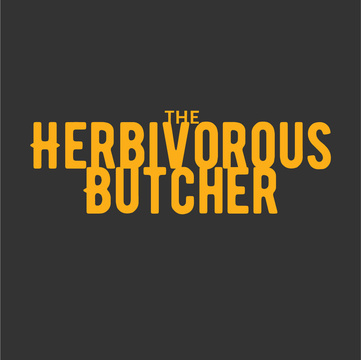
THE FINAL
LOGOS
STYLE GUIDES


MENU

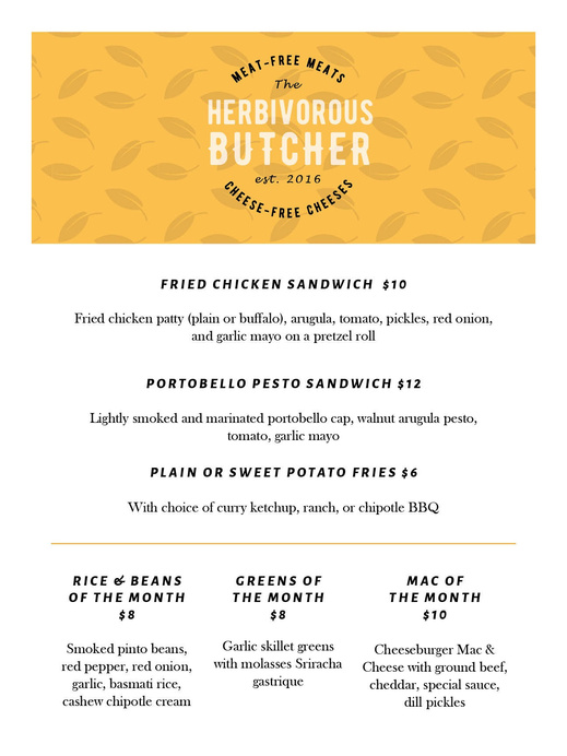
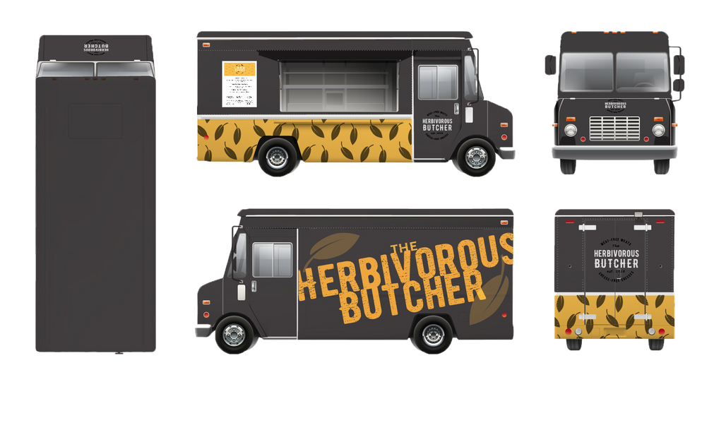

FINAL FOOD TRUCK DESIGN
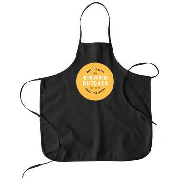
APRON
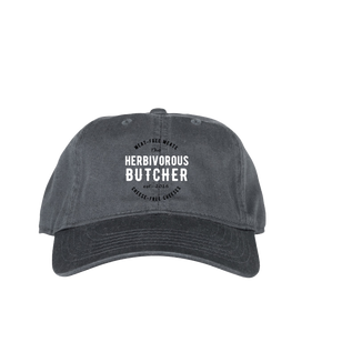
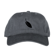
HATS
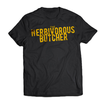
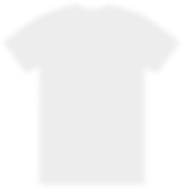
T-SHIRT
Web Design

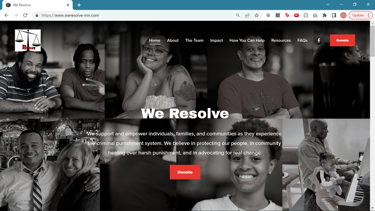
HOME PAGE DESKTOP MOCK-UP
I am currently part of the website design team for a nonprofit called We Resolve.
I recently had the opportunity to collaborate with a website developer to take this project to the next level.
Scroll to see the process!
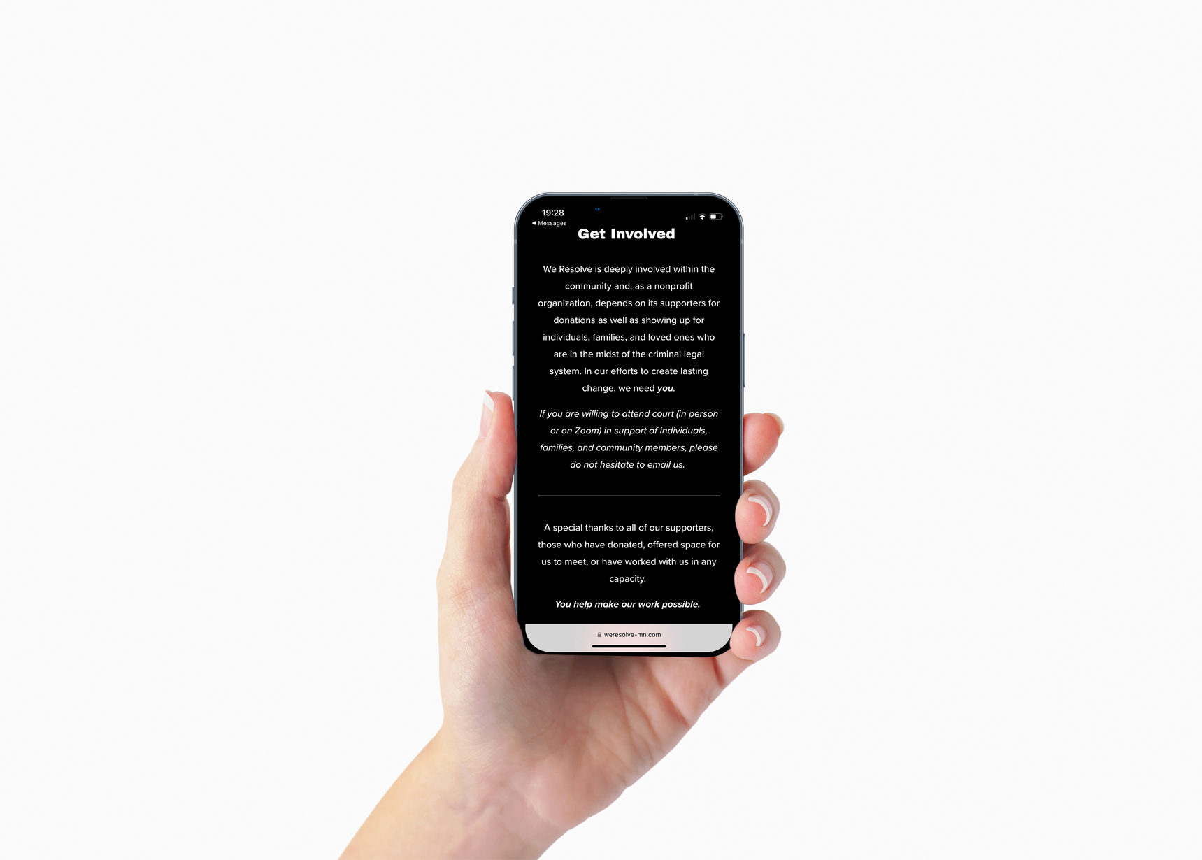
I-PHONE MOCK-UP
Originally in an internship role, I built and designed the organization's first website by collaborating with the executive director and core team.
I was responsible for gathering the necessary content, editing the material, and designing a website that reflected the organization's values and identity.
I then maintained the site by making changes, proposing new ideas, and ensuring information was accurate and clearly presented.
ABOUT PAGE
For the recent update, I collaborated with a talented website developer, Sam Glover.
This update included:
- Transferring the current content from Squarespace to WordPress
- Redesigning the website to match the organization’s new brand guidelines
- Strengthening the message of empowerment and community throughout the website
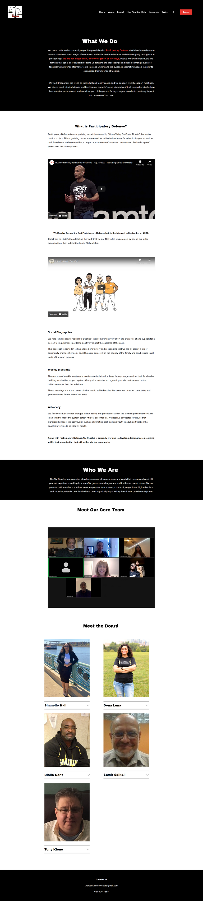
For the home page design, I focused the first block with an image that captures the essence of the organization. Immediately, an individual can tell what this organization is all about - support and togetherness. The second block builds off the first, with the mission statement and other second-tier information below.
HOME PAGE BLOCK 1 & 2 IDEATION
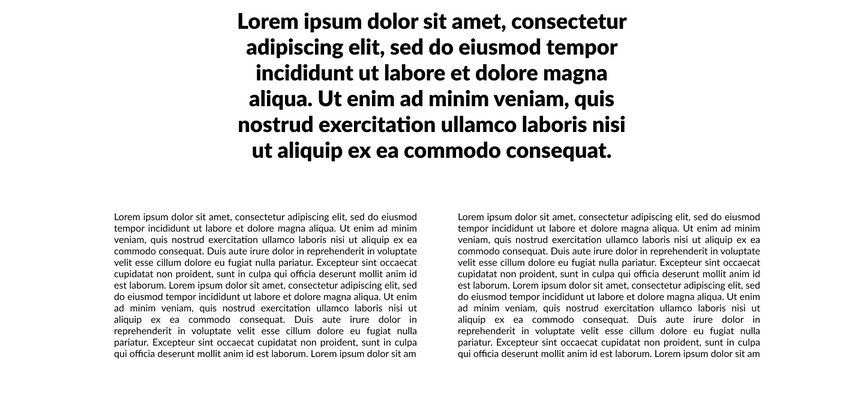
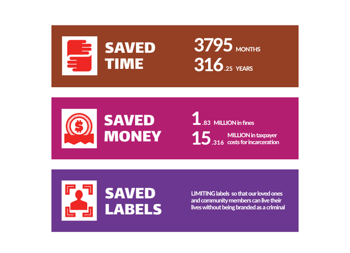
For the impact page, we wanted to ensure the organization’s quantifiable results were front and center. To do this, I gave each category it’s own moment to shine. Each area of impact is highlighted in a bold way
Then, I made sure to provide further context for each category below.
Overall, the updated website showcases a more distinct visual identity and the organization’s purpose in a new, impactful way.
To see the full site, click HERE
IMPACT PAGE BLOCK 1 & 2 IDEATION
Almond
Butter
Mock
Rebrand
EARLY LOGO DRAFTS
- goal to create an organic, natural feel

project


OVERVIEW
Rebrand Trader Joe’s Almond Butter. Give
its outdated branding a fresh look. Balance the new designs in a way that entices the 18-25 year old market but is still attractive to those who already purchase the product.
RESEARCH & IDEATION
My first step was to conduct a brand
audit. I researched the brand’s current position in the market, its relationship
to its competitors, and its strengths and weakness. I also talked with customers who purchase the product and those who do not to find out what people may find attractive about the brand and how it makes them feel. From here, I began early drafts. Key words that inspired my designs from the beginning were healthy, fresh, and nostalgic.
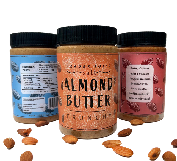
LABEL DRAFTS
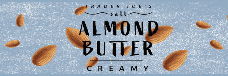
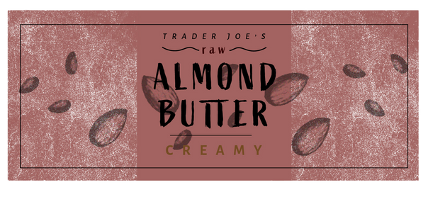

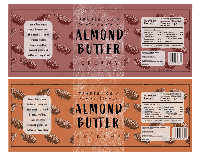
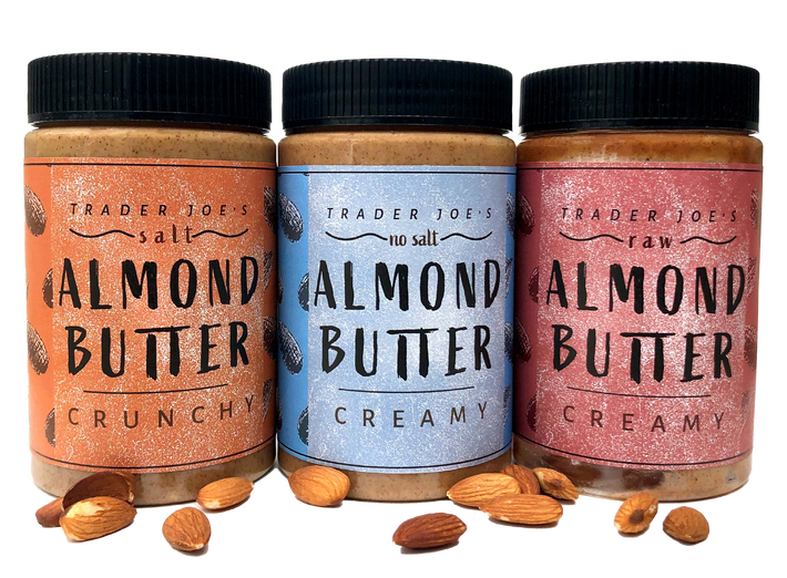
FINAL LABELS

EXECUTION
I wanted to keep in mind the product’s
niche audience while inspiring potential customers to give the product a try. I got
rid of the circusy, piratey look and feel of the current branding in favor of a design that is less cluttered. The colors and typefaces were chosen in order to create an organic, natural feel. This depicts the product’s health benefits and the more modern design will be more attractive to the 18-25 year age group.

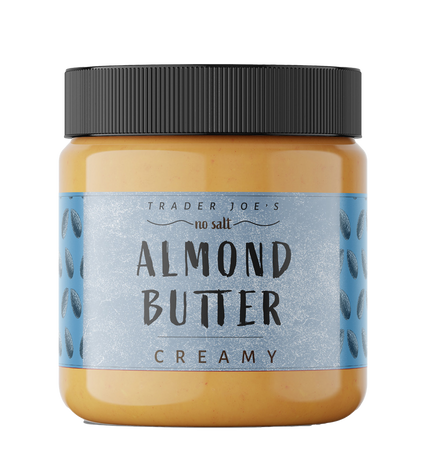

DIGITAL MOCK UP
THE FINAL MOCK UPS

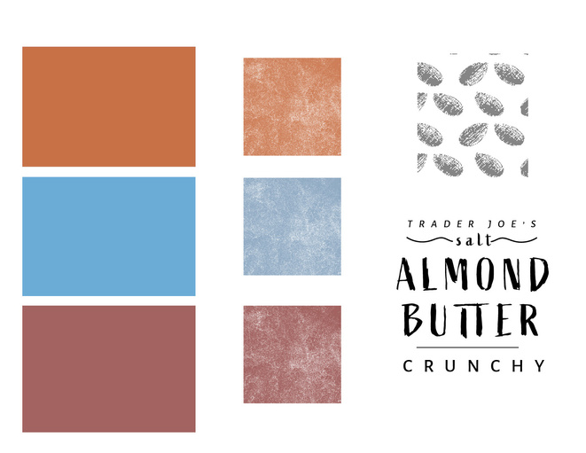

STYLE GUIDE
Zine
Chapter
project
OVERVIEW
Create a Zine chapter with content relating to the topic “things to do in quarantine.” Utilize spreads in a visually interesting way, relying heavily on layout and typographic design.
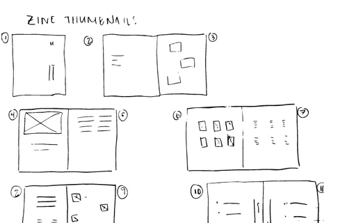
LAYOUT THUMBNAILS
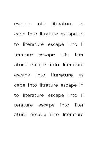
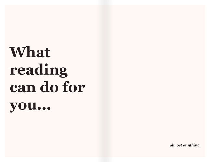
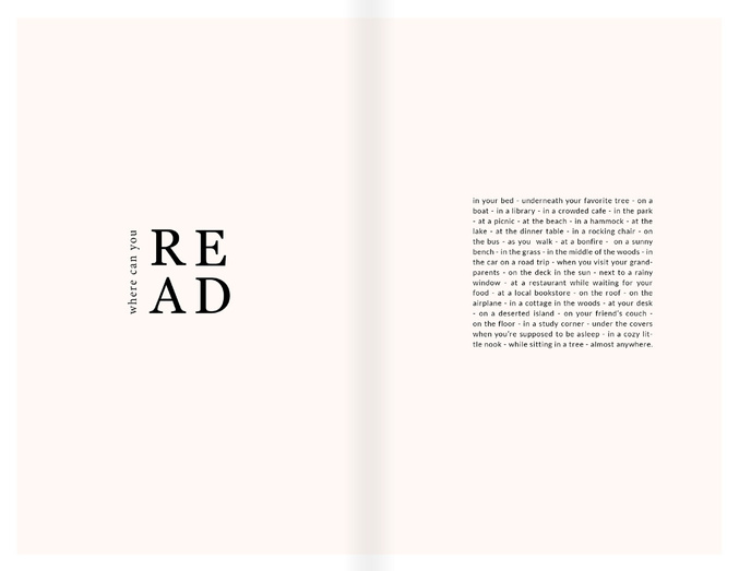
escape into
EXECUTION
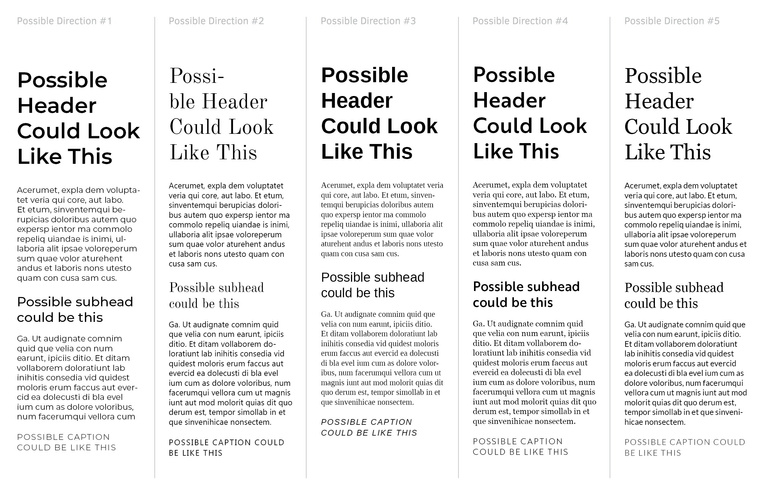
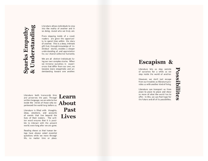
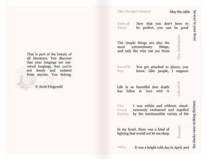
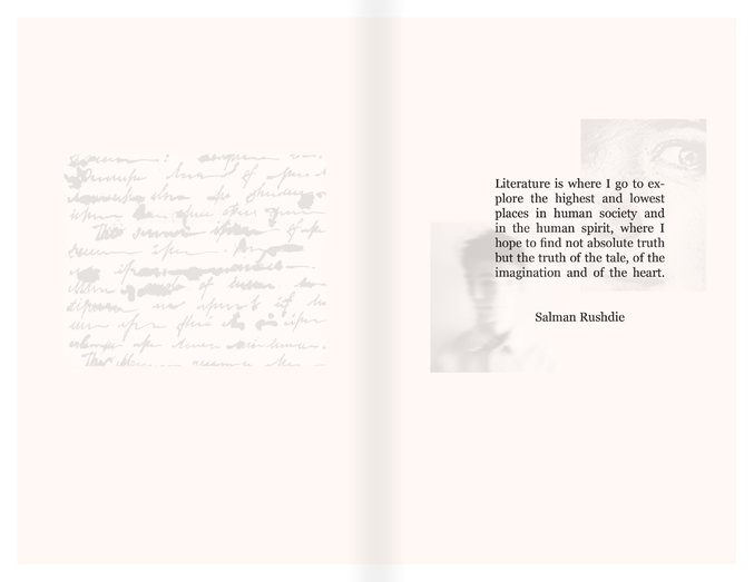
My favorite thing to do in quarantine was read, so my chapter is all about escaping into literature. I began with some layout thumbnails and brainstormed potential typefaces. In the end, I chose to design my chapter in a way that reflects the theme. The pages were designed for readability. The text is off-black with a slightly off-white background, reminiscent of older book pages. I played with opacity levels to create faint images that evoke feelings of nostalgia. I developed content about the benefits of reading and highlighted some notable literature quotes as well as quotes about literature. The last spread is about places where individuals can read and escape into literature.
TYPEFACE BRAINSTORM
literature

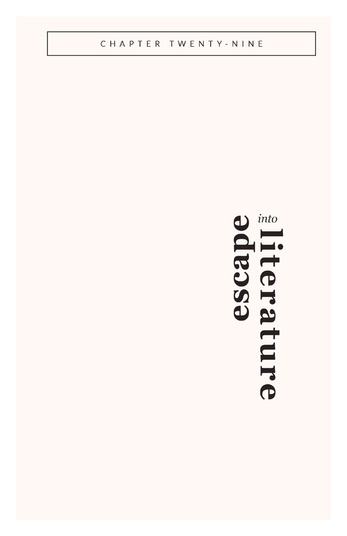
TITLE PAGE IDEATION
escape into
TITLE PAGE

SPREAD 1

SPREAD 2
SPREAD 3
SPREAD 4
SPREAD 5
Dept. Mock
Rebrand
project
OVERVIEW
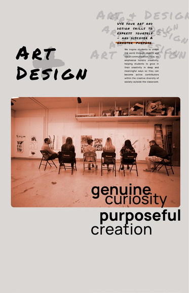
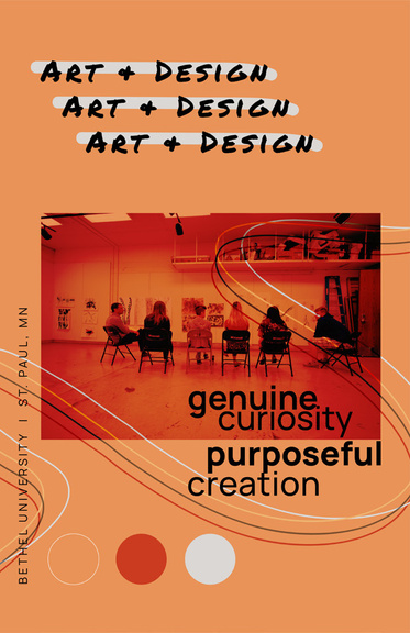
Rebrand the Bethel University Art +
Design Department. Create a new set of brand guidelines that is reflective of the department and is intriguing to current and prospective students. Develop a brochure, banner stands, a social media campaign, and department merchandise.
REASEARCH & IDEATION
In the early stages of research and by
talking to department and non-department students, I noticed some values I wanted to pull out and emphasize: celebratory, collaborative, and curious. From here, I began to consider how to visually represent these qualities. I created visual direction posters that helped me decide which creative direction to lean into. The final style guide was developed over the course of my early ideations and drafts.
VISUAL DIRECTION DRAFTS
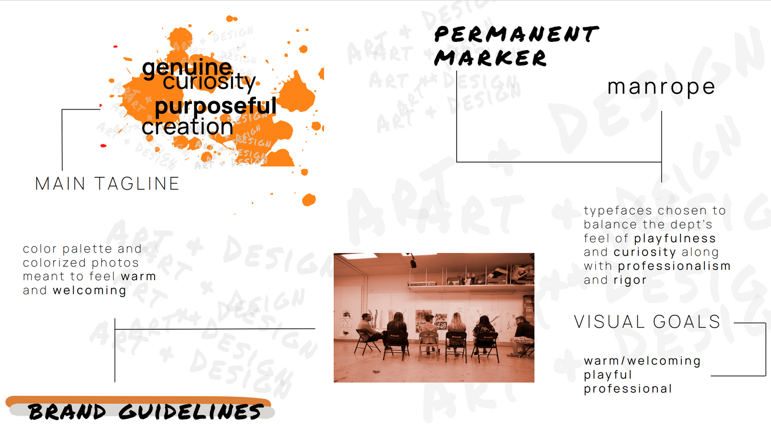
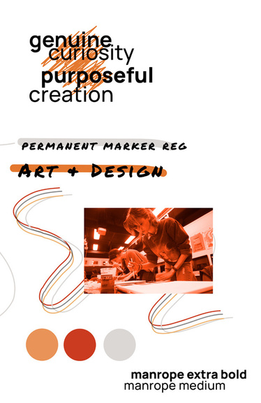
FINAL STYLEGUIDE
I developed a new brochure & social media campaign, created banner stands, and designed merchandise.
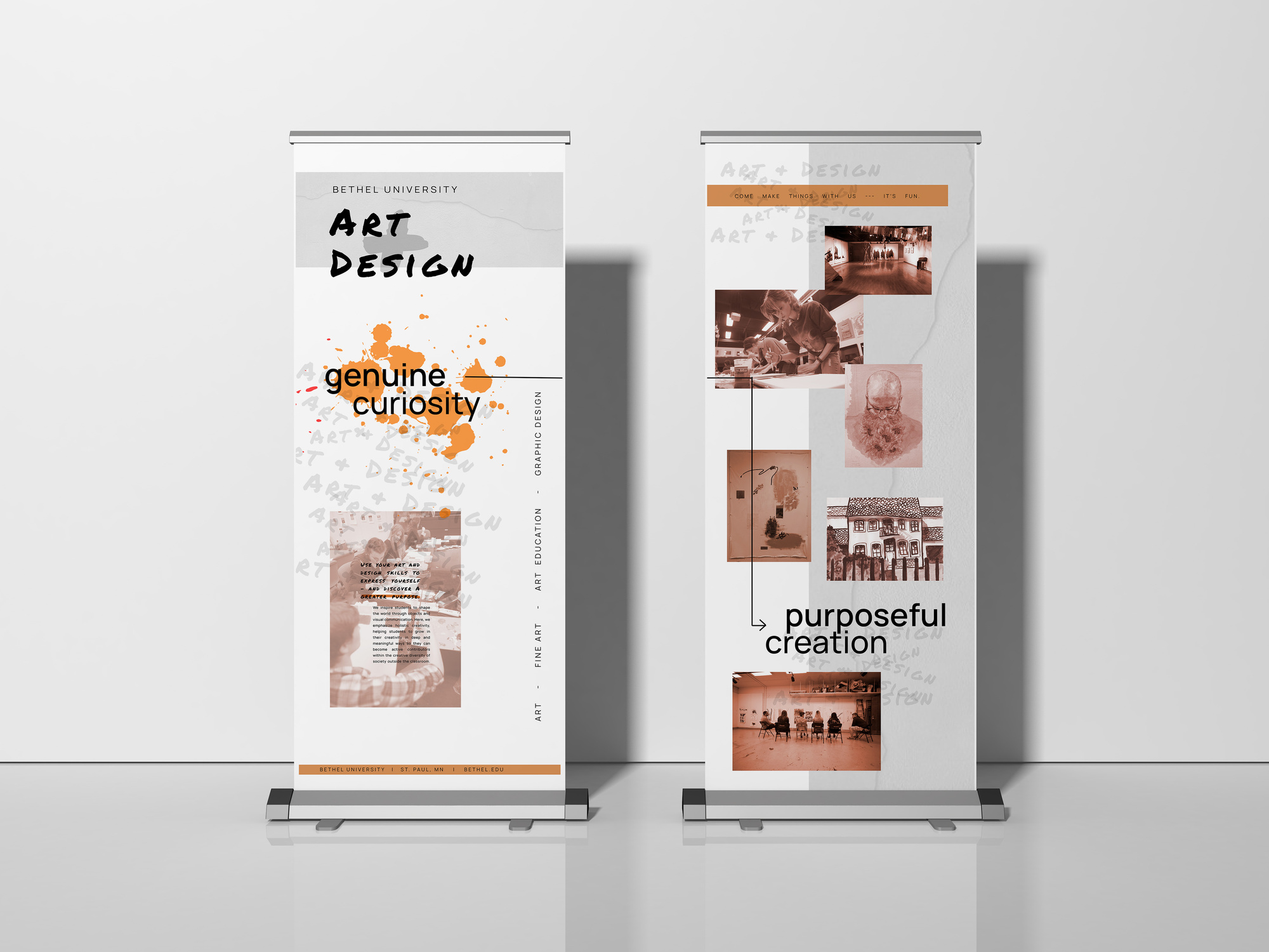

INSIDE RIGHT FLAP
BACK MIDDLE
FRONT
EXECUTION
I chose a design style that is reflective of the department’s community-based values and showcases its creativity and rigor through balancing playful and professional design elements. The color palette and treatment
of photos is warm and welcoming. It is clear the social media campaign is an extension of the brand, built with three major categories for posts and stories that will engage and inform viewers within and beyond the department.
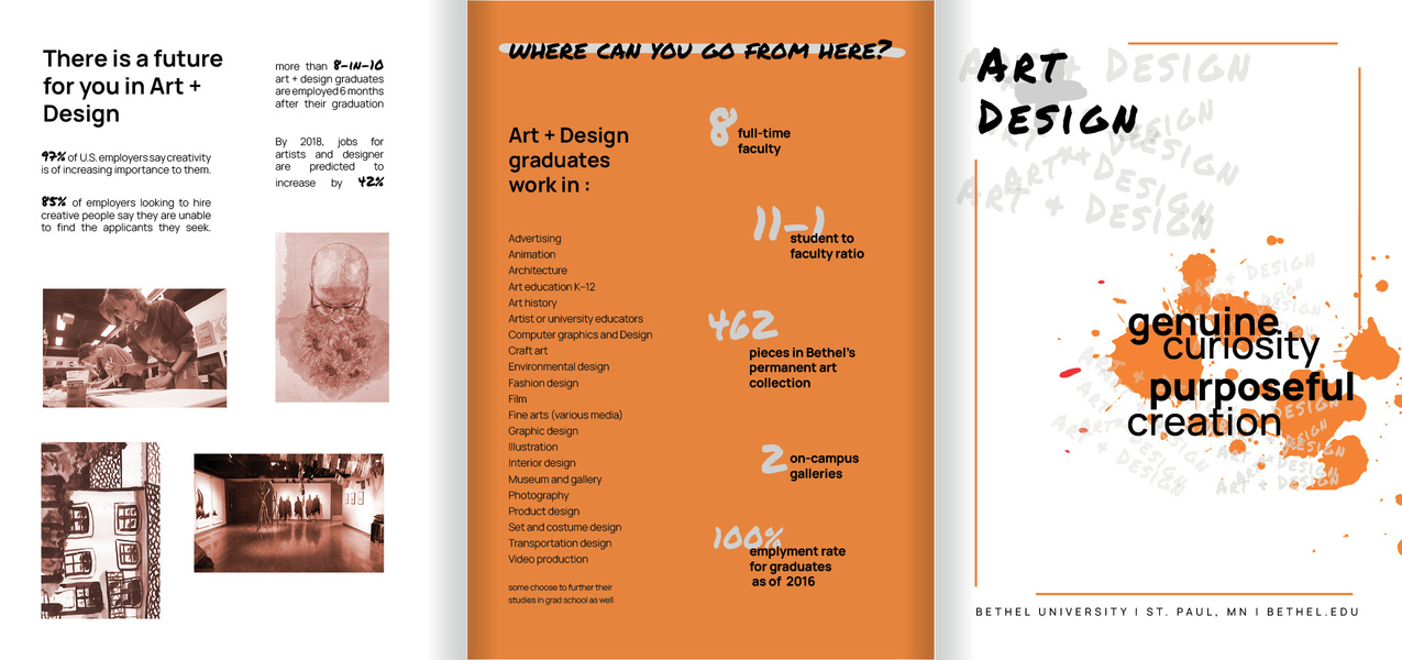
FINAL BROCHURE

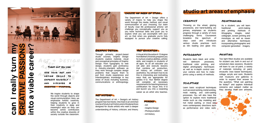
INSIDE LEFT
INSIDE MIDDLE
INSIDE RIGHT
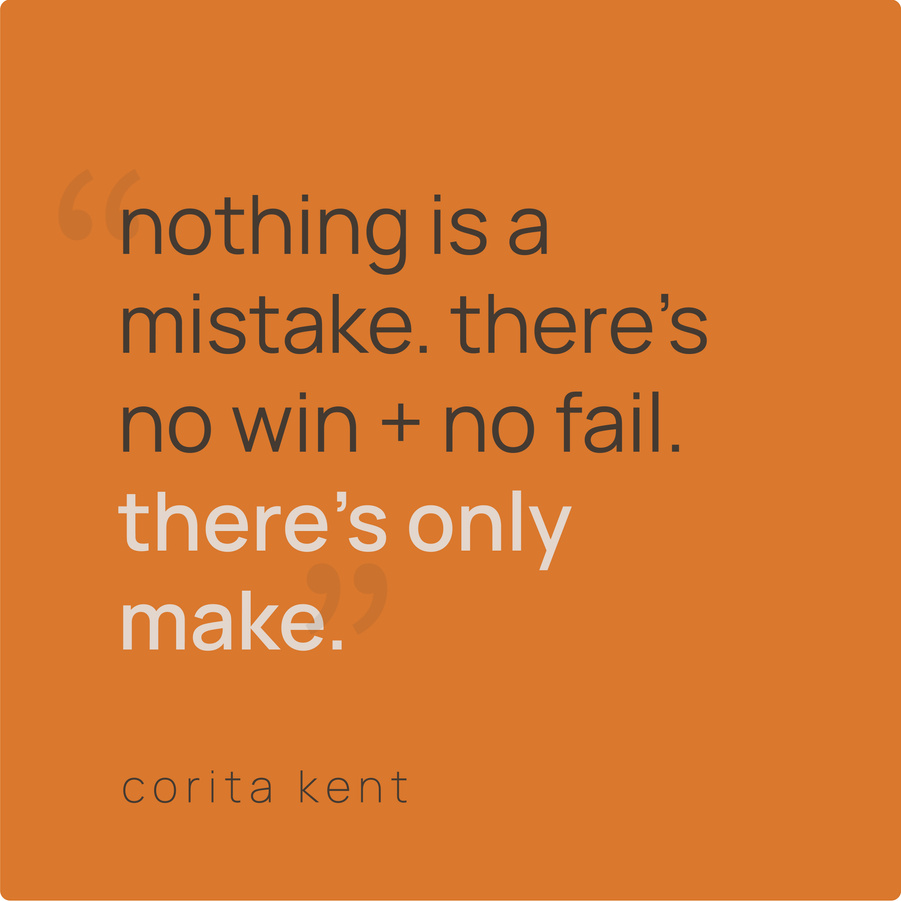
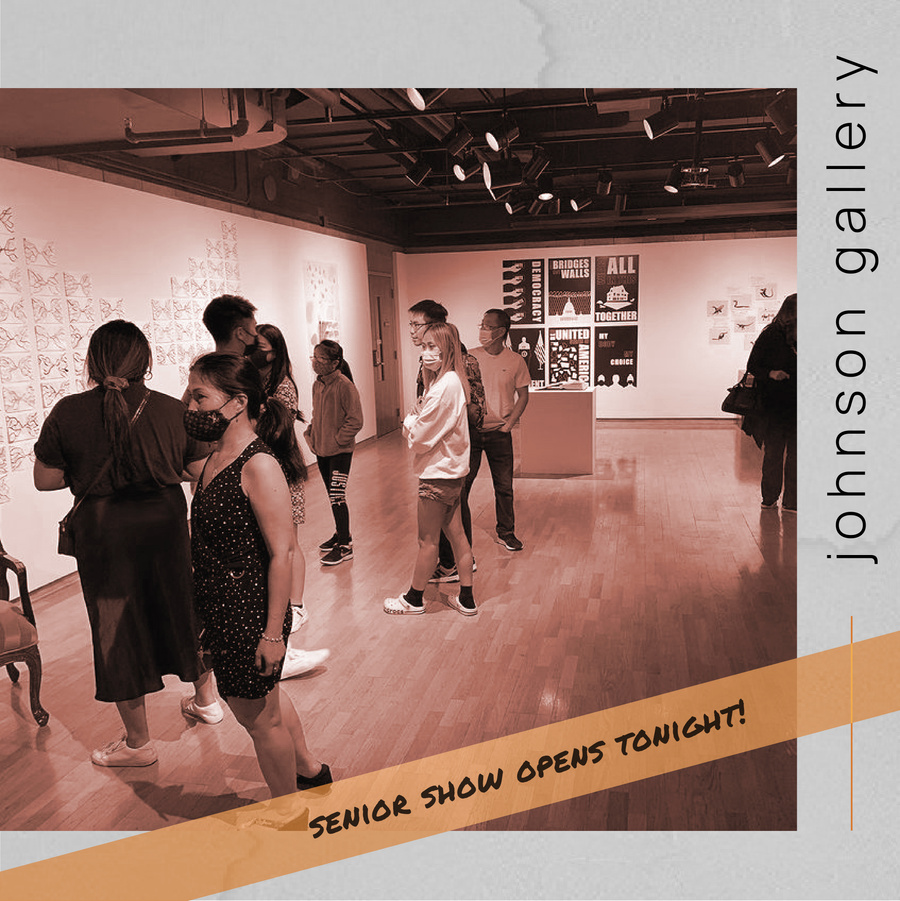
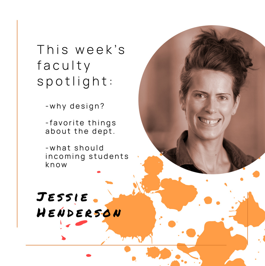
Categories for Posts
& Stories
Life of Students
- course info, student/faculty spotlights, photos, tips & tricks
2. Why Art + Design?
- quotes from students, faculty, and artists
3. Connect
- advertise student/faculty events, news about local art + alumni, info on job opportunities, Q + As
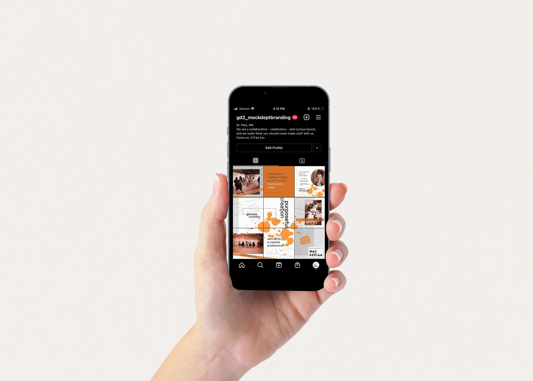
SOCIAL MEDIA CAMPAIGN
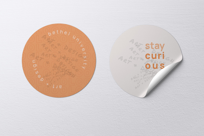
DEPARTMENT STICKERS
MERCHANDISE
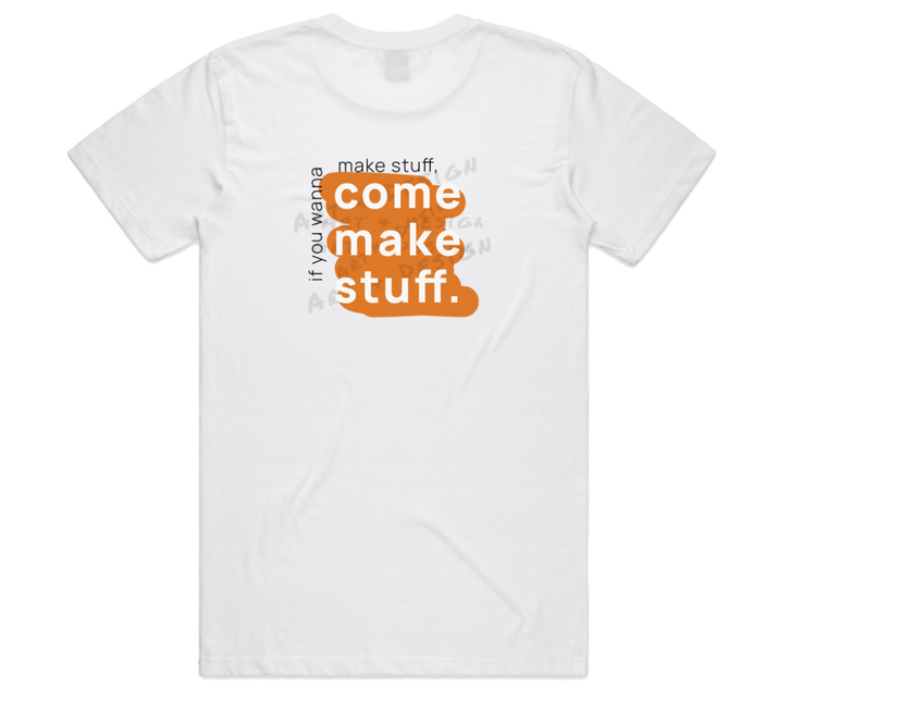
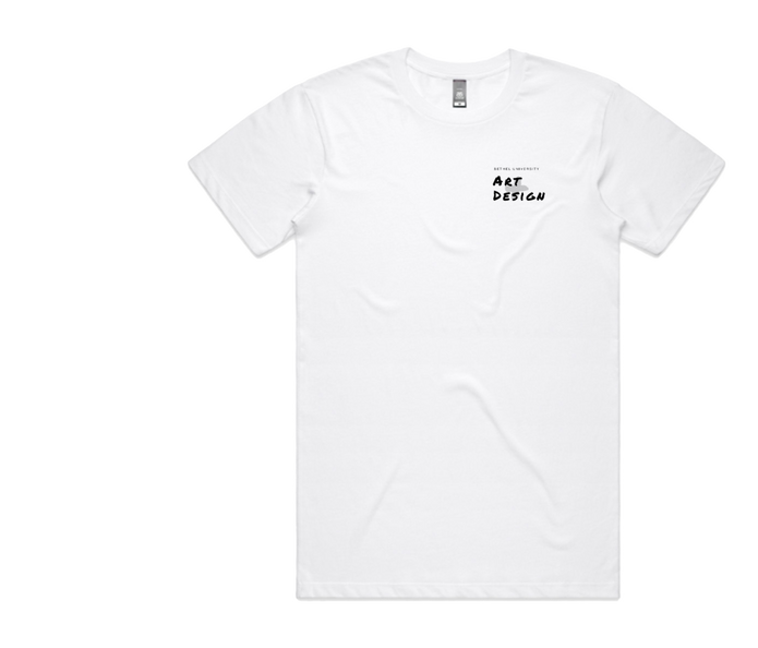
T-SHIRT FRONT

T-SHIRT BACK
Experiential
Marketing
project
OVERVIEW
Create a Bethel University Art + Design experience that reaches across the department’s usual audience. The experience should be an extension of the brand, but the main objective is to invite people to participate in a community event by providing them with a joyful experience with art regardless of their perceived artistic ability.
RESEARCH & IDEATION
After completing initial research on
popular experiential marketing projects
and taking into account previous research about perceptions of the BU Art + Design Department, I knew that I wanted to emphasize creativity and the freedom that exists within art. The department’s values of curiosity, collaboration, and a celebratory attitude should be at the heart of the experience.
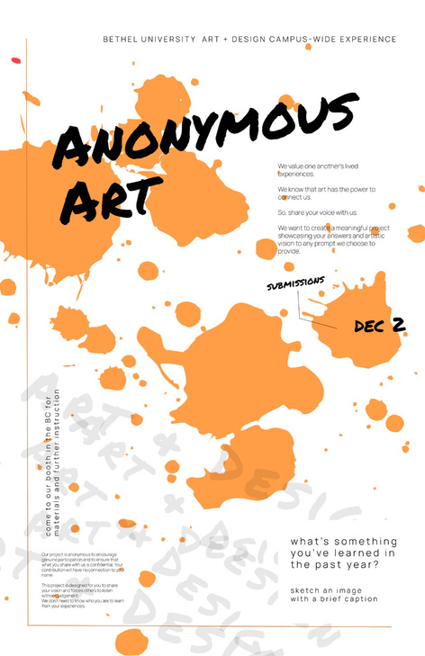
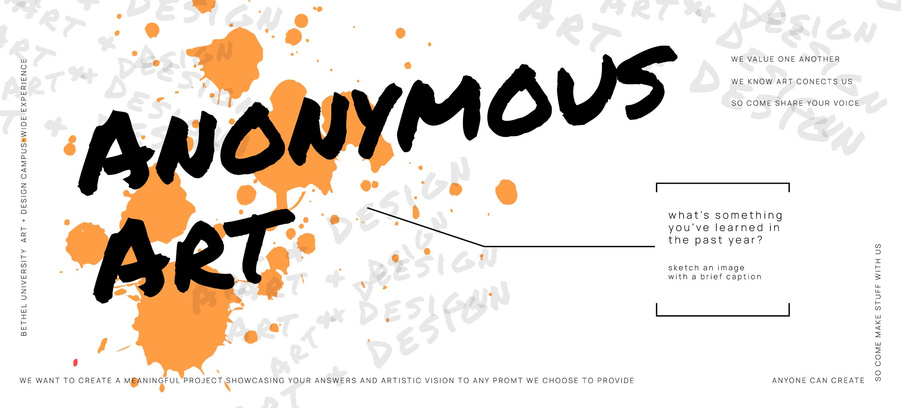
POSTER ADVERTISEMENT

INSTAGRAM POST
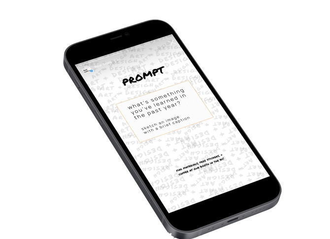

INSTAGRAM STORY
EXPEREINCE GUIDELINES
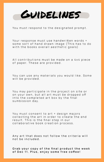
EXECUTION
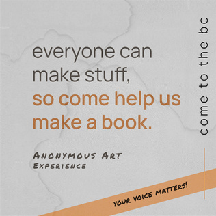
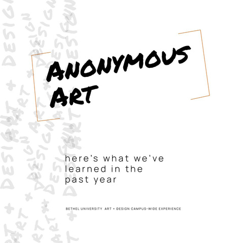
The Anonymous Art Experience is a collaborative event that anyone can participate in campus-wide. Individuals
are invited to respond to a prompt by completing a small 4x4 piece of art. The
art is then compiled into a collaborative
book that will be distributed campus-wide. All art remains anonymous to encourage participation. Ultimately, this experience showcases the curiosity of the department by recognizing that anyone can create art. We know that art connects us, and everyone has a valuable part to play. Individuals will come away feeling empowered in their own creativity.
-
DISPLAY BANNER


THE SITE
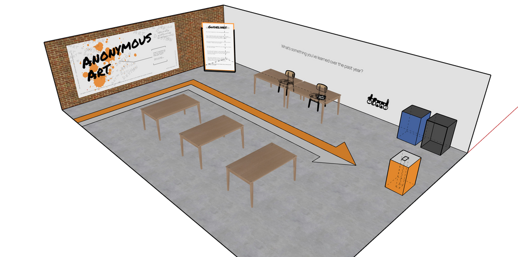
SKETCHUP MOCKUP OF EVENT SPACE
- all art supplies are provided
- guidelines for the experience are clearly displayed
- once an entry is dropped into the completed art box, the art has no connection to the creator
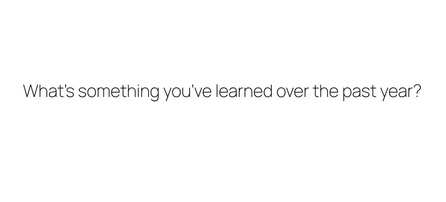
PROMPT

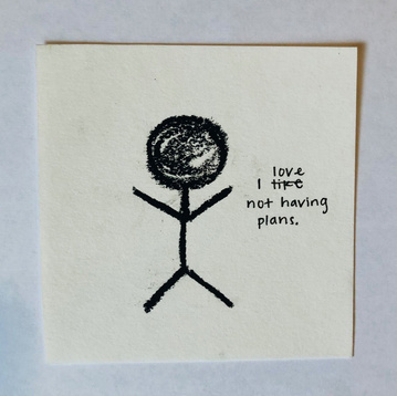
BOOK COVER
ART EXAMPLE
Publications
Fiction writing
NONFICTION WRITING
photography
"Gentle Glow"
Coeval Undergraduate Literary & Art Magazine | Bethel University
Published in the Spring 2022 edition.

Contact information

Phone
(612) 751-2742
rwaterman38@gmail.com
PORFOLIO WEBSITE